Situated high above London is one of Berkeley Group’s most exclusive flagship developments that we had the pleasure of designing.
With its autumnal tonal colour palette and floor-to-ceiling windows offering panoramic views of the city, Prince of Wales Drive is nothing short of sophistication and luxury.
Our design for the three-bedroom penthouse showhome is sleek, contemporary, and light. Freya Reed, our Senior Interior Designer behind the project, takes us through her inspiration for the design scheme…

Entrance
"In the entrance to Prince of Wales Drive, I wanted to create an inviting space and make the most of the long corridor, so I used a striking brass sideboard and eye-catching mirror. I felt the focus on metallic materials in this space really added interest and warmth."
Kitchen
"The kitchen’s breakfast bar provided the perfect view across the apartment and to the panoramic views of nearby Battersea Park, so the bar stools created a seamless balance of style and functionality that didn’t intrude on your eye line.
"The low-backed curve style of the stools adds character to the area and the accent colour draws on the tones of the rest of the living space creating a unified flow."
Dining Area
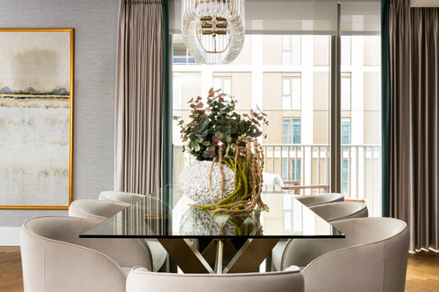
"In the dining area, I created a formal dinner setting with tactile fabrics and brass elements for a statement look with real impact. I used a glass-topped and brass table to give a contemporary feel and the curved dining chairs complement it just right. Their taupe velvet material blends effortlessly with the rest of the room.
"The glass chandelier adds ambient lighting, and I framed the entire dining space with a textured rug to bring it all together."
Living Area
"The living area needed to be multi-functional and provide space for both relaxing, and entertaining, so I selected furnishings to create 'zones'.
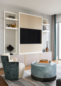
"In the formal seating area, I added a light teal armless corner sofa and paired it with a circular coffee table, which created a calming fluidity. I also added a contrasting occasional chair with a floral fabric and a marble-top side table. This all sat surrounding a bespoke joinery unit, finished in taupe leather and tweed backboard to give a tactility and to soften the aesthetic. Not only does it house the television, but it also offers a display of objet d’art - the finishing personal touches to any space. I used a secondary rug to zone this area and for a soft and inviting feel on top of the hard flooring.
"Behind the sofa, I used two textured tub chairs and a brass coffee table to create an elegant reading area. The contrasting amber cushions capture your eye and add a contemporary touch. This area encapsulates the autumnal colour palette requested by the client, as well as adding warmth and personality. The freestanding detailed screen alludes to elevated brass finishes whilst allowing your eye to move around this area of the room, helping to once again zone the space and invite intrigue.
"I really like this small seating area. It has a saturated but luxe palette with some high-end fabrics. I'm really pleased with how the overall aesthetic turned out, especially with the backdrop of Battersea Park in the distance.
"Creating the living space was definitely my favourite element of the whole design. The textures, tones, and fabrics were fun to work with and I used my technical knowledge to design the joinery and plan the ergonomics of the space.
"I loved making the most of the light and airy feel of the apartment and putting the emphasis on the views over the Park. You can see the boating lake from the living room, which is pretty special. For an area that has now been heavily regenerated it offers a calming influence.
"I considered every level of detail in this room and made sure to add contrasting textured patterned fabrics to add areas of interest. The finishes were luxe and all complimentary of one another to design a seamless space."
Bedroom One
"I wanted Bedroom One to have a contemporary but opulent feel so I used a focal wallpaper and contrasting headboard. I added brass side lamps and golden oak bedside tables to evoke a hotel-inspired look and finished it with soft upholstery and accessories.
"Part of the brief from the client was the need for a designated workspace so I included a considered desk area in the bedroom too."
Bedroom Two
"Bedroom Two needed to serve as a comfortable guest room, so I added a vertical headboard to create memorable impact. I introduced plenty of tonal colours through wooden finishes and decorative accessories to continue the feminine feel, and to add comfort and luxury."
Bedroom Three
"Bedroom Three was aimed towards a slightly younger audience, being the tertiary bedroom. By introducing punchier colours in the cobalt longline headboard and wallpaper, we were able to create a memorable space with an impact.
"The headboard helps to elongate the room, opening the space up to allow for a freestanding wardrobe and dressing table area, with the clever use of an oversized brass mirror to tie back into the rest of the apartment."
Bathroom
"In the bathroom, I selected an eclectic mix of accessories."
Balcony
"Because of the impressive views from the apartment, dressing the outside balcony space was very important. I took inspiration from Battersea Park and added lounge-style seating and a selection of planters."
“I loved working on this project. There were a lot of bespoke elements needed and the quality and finish had to be flawless.
"The initial feedback from the client was really positive, and since completion, the penthouse apartment has sold for the asking price – and it’s the highest price ever recorded at the development!”
To see more of our luxury showhome projects please visit our portfolio: www.vesta-london.co.uk/projects


댓글